
Tessa Davis@TessaRDavis
Sep 23, 2022
20 tweets
Sharing your data effectively gives you access to impact, investment, and change.
But most of us are terrible at it.
A pie chart isn't the answer to everything.
Here's a guide to 17 chart types and when to use them:
Before we start, you need to know the key is finding the story in your data.
That's how you'll bring about change.
Otherwise your audience leaves feeling confused.
Once you have this, it's time to choose a chart type.
(h/t to @Canva + @Flourish for the graphics).
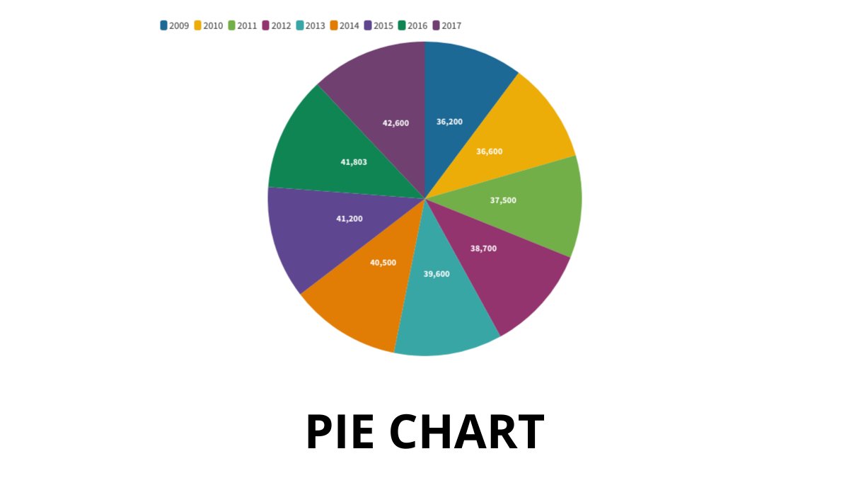
#1: Pie chart.
Each slice is one part and they all add up to the whole.
Good if one segment is very large OR small.
Easy to interpret.
However, it's not great at comparing relative sizes.
#2: Bar chart.
This is multiple rectangles running to the baseline.
The height corresponds to the value.
Our eyes are great at comparing lengths well, so this is easy to read.
Good for categorical data.
They can be vertical, horizontal, or stacked.

#3: Waterfall chart.
This is a more advanced bar chart.
• First bar show starting value
• Last bar shows end value
• Bits in between show the incremental change
Good for demonstrating complexity.

#4: Line chart.
This one is simple.
It's a line connecting points over time.
There needs to be a meaningful relationship between the points in the line. They are connected.
Good for:
• Showing change over time
• Forecasting

#5: Slope graph.
Like a line graph but with only two points on it.
Could compare multiple related categorical variables e.g. sales of product 1 v product 2 over time.
Good to show how values change over time.

#6: Area graph.
This is like a line graph but the space below it is filled in.
Compared to a line graph, our eyes see:
• Less of the line varying over time.
• More of the volume varying over time.
Good for:
• Showing the rise + fall
• Conveying total amounts over time

#7: Scatterplot.
Shows the relationship between two values plotted on x and y.
It's better used to UNDERSTAND data rather than COMMUNICATE data.
So probably best to avoid using these in your presentations.
The are usually exploratory only, to see trends and relationships.

#8: Radar chart.
Displays data across several dimensions.
Usually quantitative.
Each direction represents a variable + the length of is proportional to magnitude.
Can be complicated to interpret at first glance but then is a useful visual.
Good for showing outlier areas.

#9: Box plot.
This chart provides a lot of info:
• Min
• Max
• Median
• Lower quartile
• Upper quartile
It's used to look at the distribution of multiple data sets next to each other.
Not that easy to use if you aren’t familiar with it, so best left out of presentations.

#10: Tree map.
Uses nested shapes which are sized proportionally.
Helpful to visualise larger amounts of data.
Also has subfolders so it is good for relationships in categories.

#11: Stacked circles.
A variation of a tree map.
Overlapping relationships in shapes and the size correlates to volume.
Used to narrow down a broad topic in sub topics.
Good for emphasising relative size in very visual way.

#12: Bubble chart.
Like a scatter plot, but the size (or color) of the dots are important.
Adds more dimensions than a scatter plot.
Good for seeing easily different sizes of multiple variables.

#13: Pictogram.
Uses pictures to represent data in a simple way.
Can be used to show survey results or ratings.
Clear icons and pictures make it quickly understood.
Good for making data easily accessible.

#14: Sankey diagram.
This shows the flow of resources.
• Sources
• Use of materials
• Costs
Width is proportional to quantity.
Good to show complex processes visually.

#15: Heat map.
Uses colors to convey information.
Can help show which areas need more attention.
Often shows numbers in the cells too alongside the colors.

#16: GANTT chart.
Use to show a project schedule over time.
Helpful for resource allocation.
Good for scheduling and timelines in project management.

#17: Chord diagram.
Visualizes connections between two things (nodes).
The size of the arc is proportional to importance or volume.
This shows the number of words spoken between characters in friends.

If you enjoyed this thread then:
1. Subscribe to my newsletter:
tessardavis.com/newsletter
2. Jump to the first tweet of the thread and retweet it:
x.com/TessaRDavis/st

Tessa Davis@TessaRDavis
Sep 23 22
View on Twitter
Sharing your data effectively gives you access to impact, investment, and change.
But most of us are terrible at it.
A pie chart isn't the answer to everything.
Here's a guide to 17 chart types and when to use them:

Tessa Davis
@TessaRDavis
NHS Consultant Interview Coach | Doctor | Helping People To Secure Their Dream Job
Missing some tweets in this thread? Or failed to load images or videos? You can try to .