
Yannick Lung@yannicklu
Sep 23, 2022
22 tweets
Since I get asked every now and then how I design my icons and what things to look out for, I think now is a good time to go into some tips and tricks. Some of them are more technically oriented, while others are of a design nature.
#SketchDesignChallenge
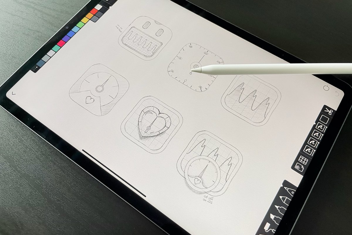
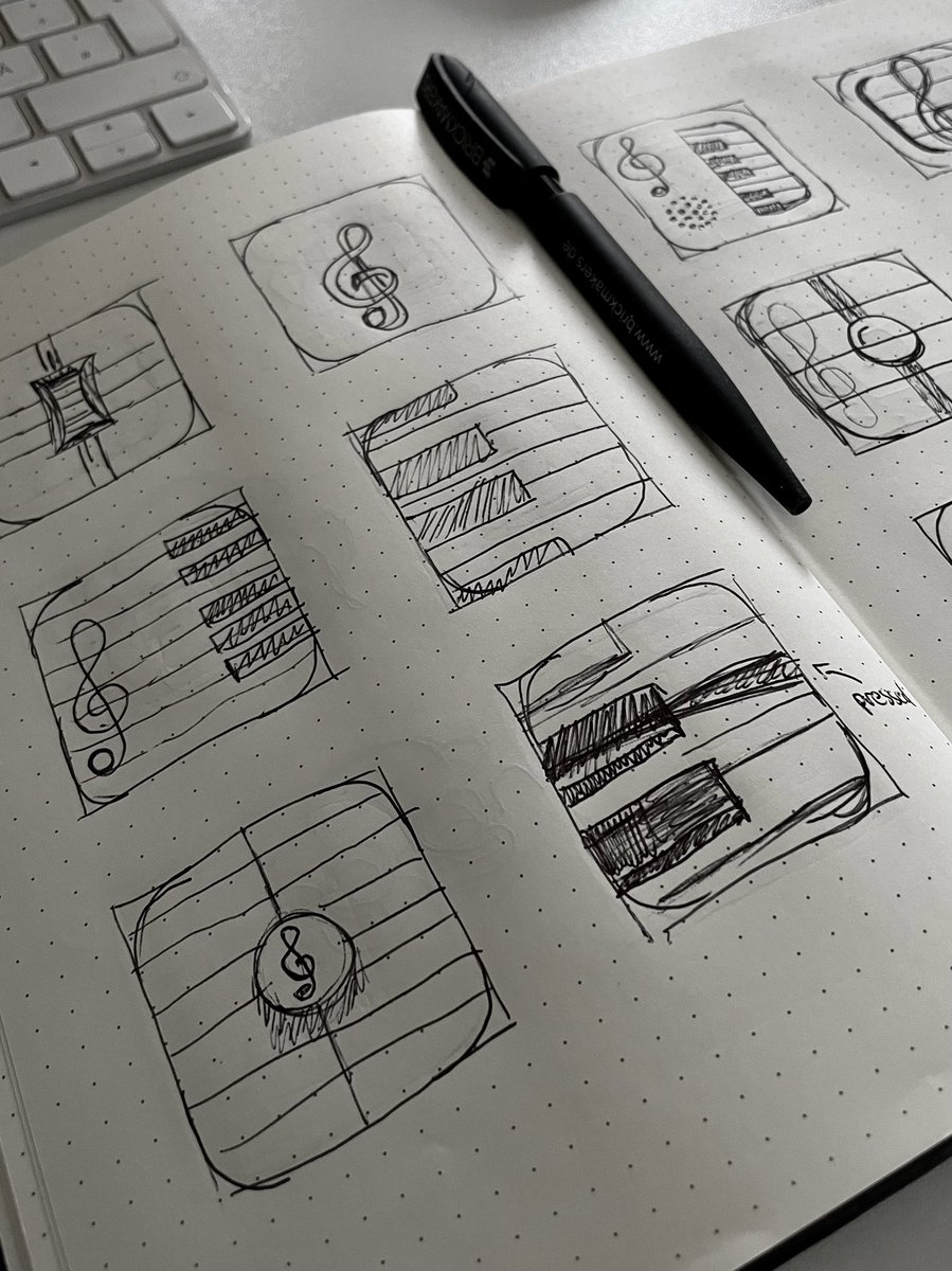
Before I even open Sketch, I like to take the time to quickly try out some ideas on paper. This can be done traditionally with pen and paper or digitally on the iPad and the Apple Pencil. This makes it much easier to get a rough feel in advance.
#SketchDesignChallenge
If you are unsure where to start, I highly recommend reading the associated guidelines first. These often contain basic principles you can use as a guide.
iOS/macOS App Icons  developer.apple.com/design/human-i…
Android Product Icons material.io/design/iconogr…
#SketchDesignChallenge
developer.apple.com/design/human-i…
Android Product Icons material.io/design/iconogr…
#SketchDesignChallenge
developer.apple.com/design/human-i…
Android Product Icons material.io/design/iconogr…
#SketchDesignChallenge
Speaking of guidelines, there are some great app icon templates and resources out there to make your life easier. Highly recommended are the ones from @Max Rudberg or @Michael Flarup.
iosicontemplate.com
applypixels.com/resource/macos…
applypixels.com/resource/ios16…
#SketchDesignChallenge
iosicontemplate.com
applypixels.com/resource/macos…
applypixels.com/resource/ios16…
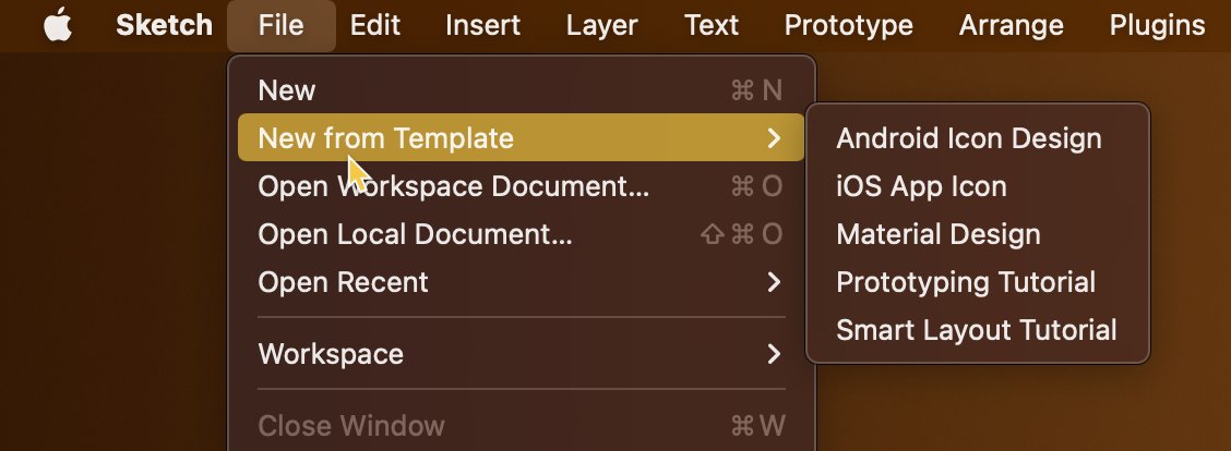
#SketchDesignChallengeIn addition, Sketch has built-in icon templates. These can be accessed via File → New From Template → [Platform Name]
#SketchDesignChallenge
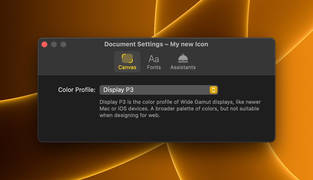
If it is an app icon for iOS or macOS, it is a good idea to design the icon in the Display P3 color space. This makes colors look more vivid and clear.
To activate this setting, go to File → Document Settings... and select “Display P3” for Color Profile.
#SketchDesignChallenge
If the app icon is intended for iOS, please export it *without* rounded corners, so only in square format. The masking of the rounded rectangle (squircle) is done by the system itself. #SketchDesignChallenge
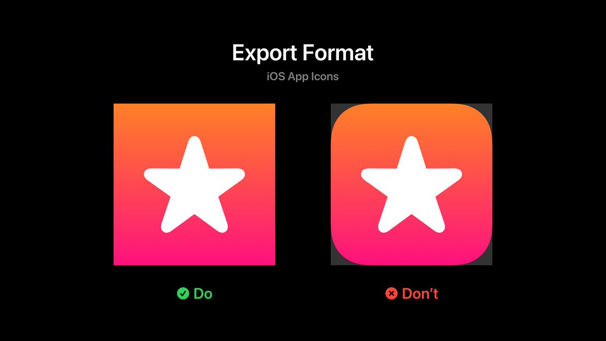

Otherwise, the animation of the app will look strange when you quit it.
#SketchDesignChallenge
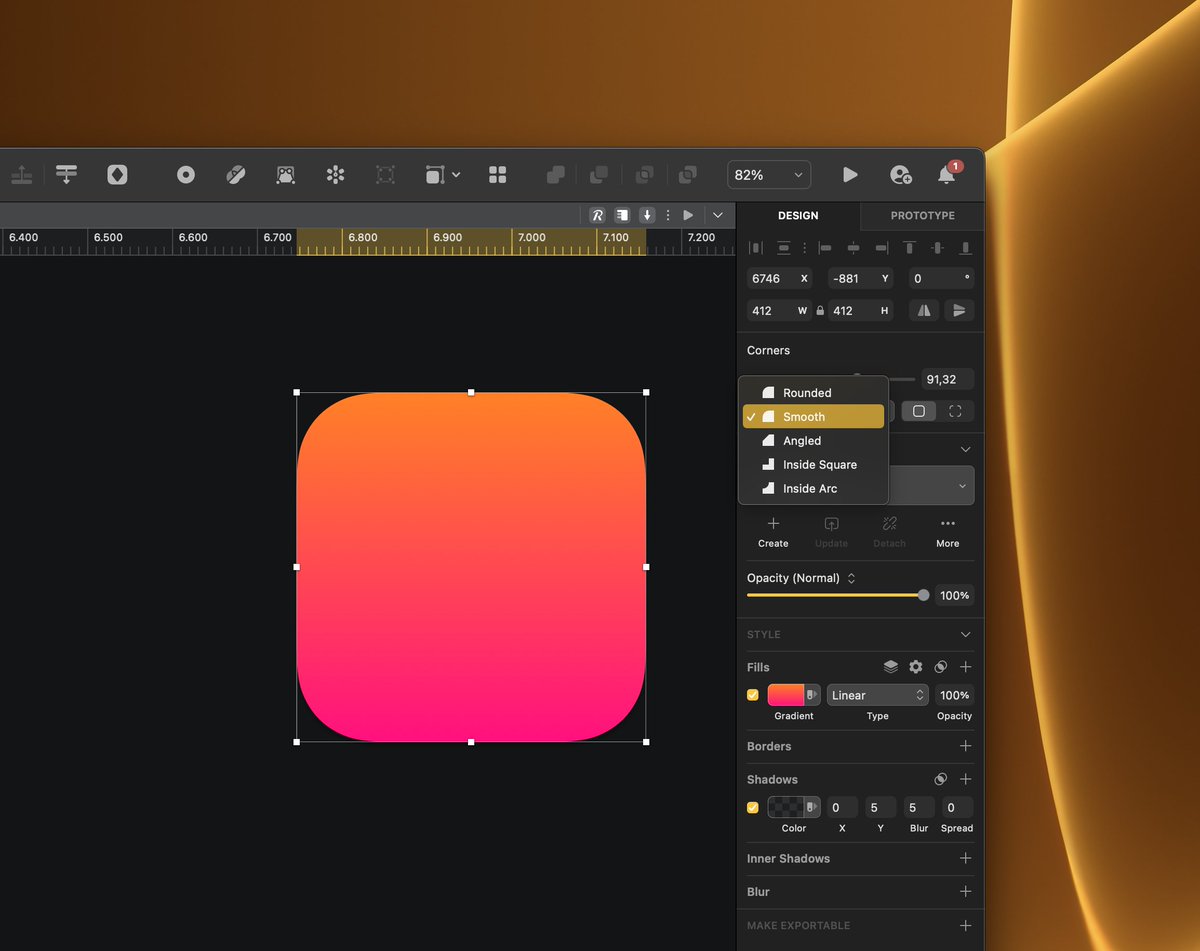
In comparison, on macOS it is recommended to export the icons in squircle format with border spacing (macOS Big Sur and newer).
#SketchDesignChallenge
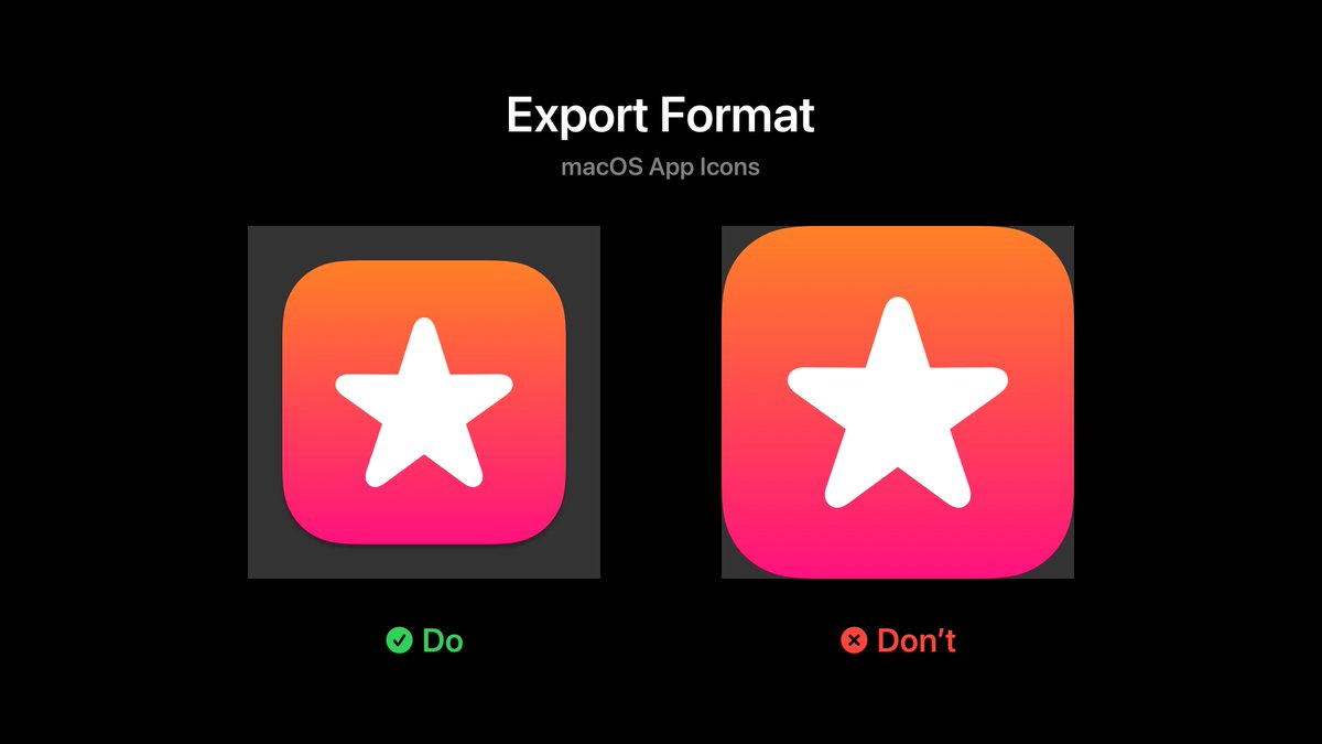
The reason why I say that? Some Mac apps use the wrong proportions, so the icons look a good bit bigger. Especially in the Dock, the icon breaks out because it doesn’t fit with the rest. Please don’t do that.
#SketchDesignChallenge
How do you get around the whole thing? Let’s say the artboard is 512 × 512. Then the base layer should have a size of 412 × 412 pixels.
Alternatively you can download the official macOS App Icon Template from Apple directly.
developer.apple.com/design/resourc…
#SketchDesignChallenge
developer.apple.com/design/resourc…
#SketchDesignChallenge
Since we are talking about macOS icons: To stay consistent with other app icons, the base layer should have a black shadow with alpha of 30%, y-offset of 5 and blur also of 5.
#SketchDesignChallenge

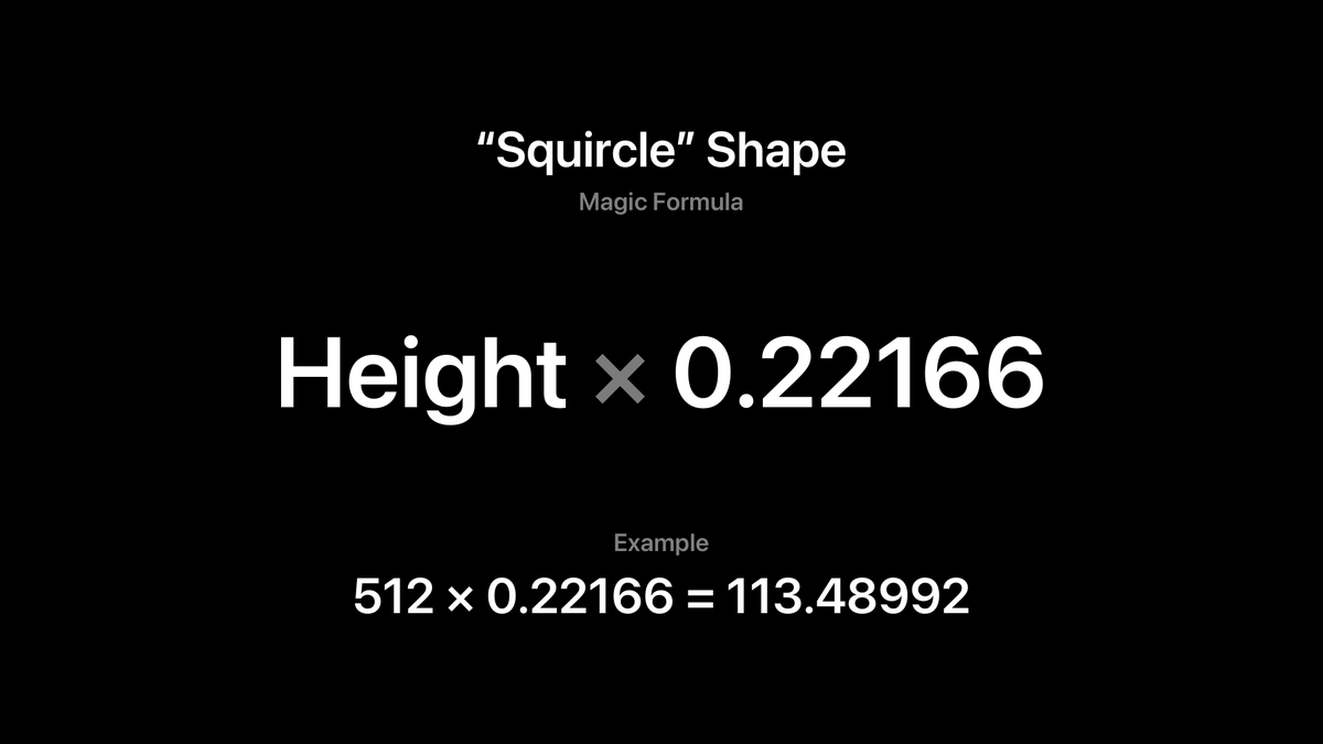
The word “squircle” has come up before. Apple is known for using particularly soft rounded edges. To achieve this effect in Sketch, you should definitely switch from Rounded Corners to Smooth Corners.
#SketchDesignChallenge
Believe it or not, for the Squircle there is even a “magic formula” to create the shape.
Set the Corner parameter to Smooth Corners and multiply the height of the square plane with 0.22166
This creates a shape that is very close to the squircle.
#SketchDesignChallenge
But enough with mathematical formulas. Let’s move on to a few of my favorite tools that I use most often during the design process.
#SketchDesignChallenge
The Offet tool is useful for quickly creating new layers that are sized to match other layers. This is especially useful for maintaining the proportions of the squircle.
#SketchDesignChallenge
Blend modes allow colors to have an indirect influence on each other. Instead of black shadows or white highlights, the colors “blend” into each other, making the overall image look more natural. My two favorites are “Plus Lighter” and “Plus Darker”.
#SketchDesignChallenge
Blurs are wonderful for softening hard edges. They are particularly suitable for reflections or other light effects. Be sure to create masks so that the blur does not extend beyond the object’s boundary.
#SketchDesignChallenge
The Scissors tool is handy for cutting up layers. For example, I often use it when I want to create an effect only in a very specific place.
#SketchDesignChallenge
Similar to animation curves, linear gradients can sometimes look unnatural. This can be remedied with the Easing Gradient plugin, which creates bezier-like gradients.
github.com/larsenwork/ske…
#SketchDesignChallenge
github.com/larsenwork/ske…
#SketchDesignChallenge Also, don’t worry too much about ordering and naming the layers. During the process, it’s perfectly fine if the layer list looks messy… As long as it doesn’t turn into a Very_Final_Copy16.sketch —everything is fine  It’s a creative process after all!
#SketchDesignChallenge
It’s a creative process after all!
#SketchDesignChallenge
It’s a creative process after all!
#SketchDesignChallenge 
As for process in general, I’m a big fan of iterative design. That means creating as many artboards as possible—each with a small change more. That way you can quickly jump back and know afterwards how something came to be. #SketchDesignChallenge

Missing some tweets in this thread? Or failed to load images or videos? You can try to .