
We spend a lot of time talking about component structure, but the library files themselves are often ignored
So what goes into structuring a good Figma component library?
Here are a few tips, hopefully a good starting point 
The first thing we want to decide is whether we use one file or many files
Both are fine! Single file is best for smaller projects, or when you're thrashing around at the start of a bigger system project
Separate files are best for collaboration, performance, and versioning

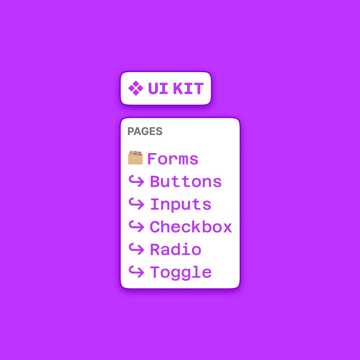
Then we want to start thinking about page structure
I find it really useful to include emojis here!
A folder emoji  for component groups e.g. forms, menus, tables
A return arrow emoji
for component groups e.g. forms, menus, tables
A return arrow emoji  For the individual components within the groups
e.g. Form Inputs, Menus Tab bar
For the individual components within the groups
e.g. Form Inputs, Menus Tab bar
for component groups e.g. forms, menus, tables
A return arrow emoji For the individual components within the groups
e.g. Form Inputs, Menus Tab bar 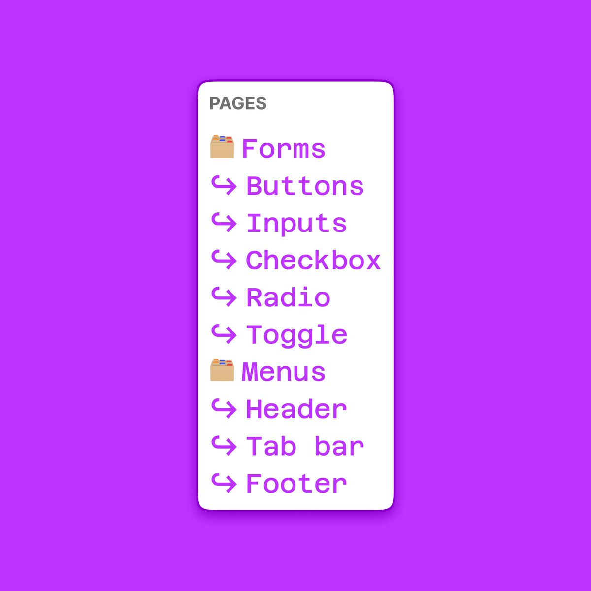
Next up is the components themselves
Variants are great! But be careful to not "explode" them = put too many components in one variant
I try to optimise for searching / usage rather than maintenance here ( IMPORTANT)
So, split variants where it makes sense for search
IMPORTANT)
So, split variants where it makes sense for search
IMPORTANT)
So, split variants where it makes sense for search 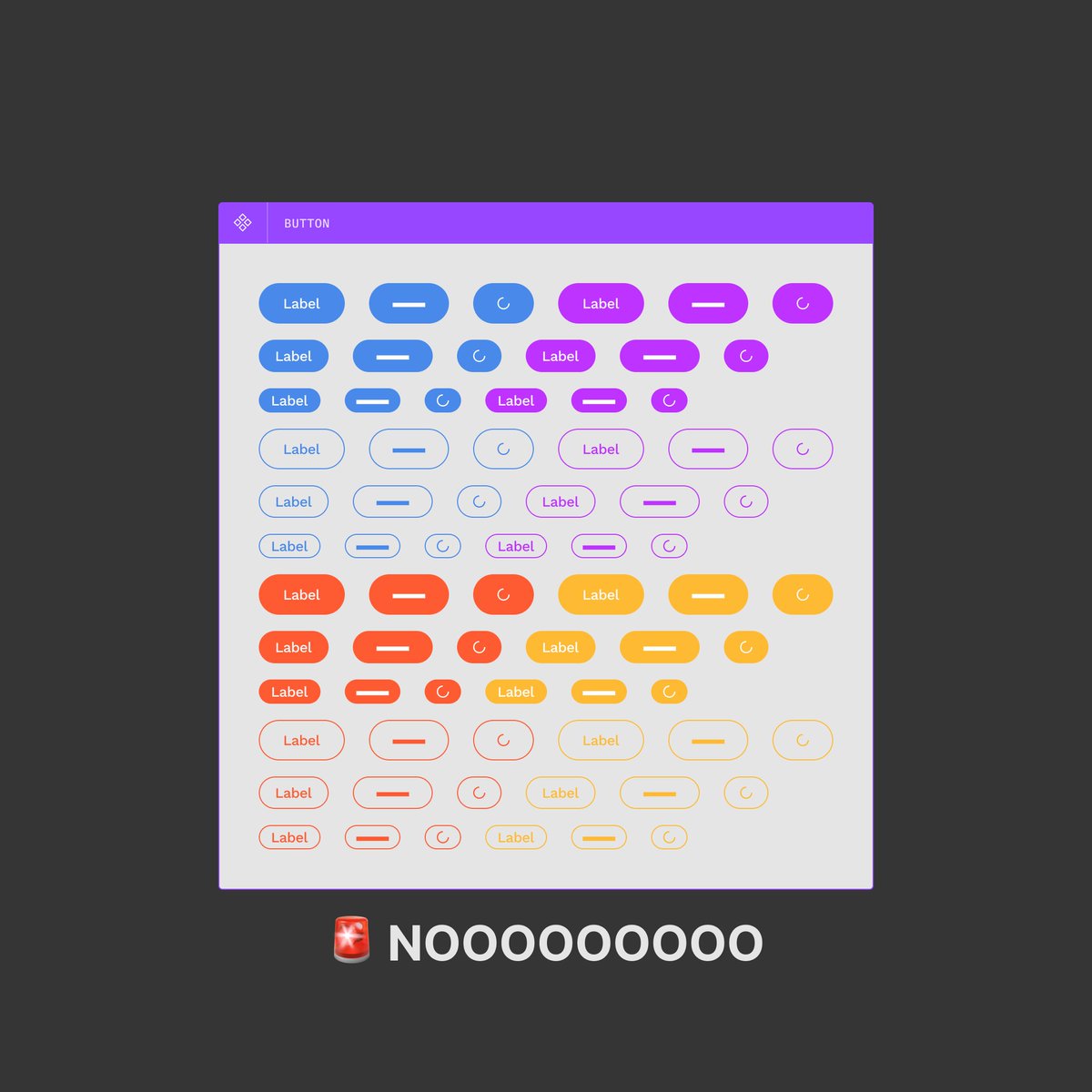
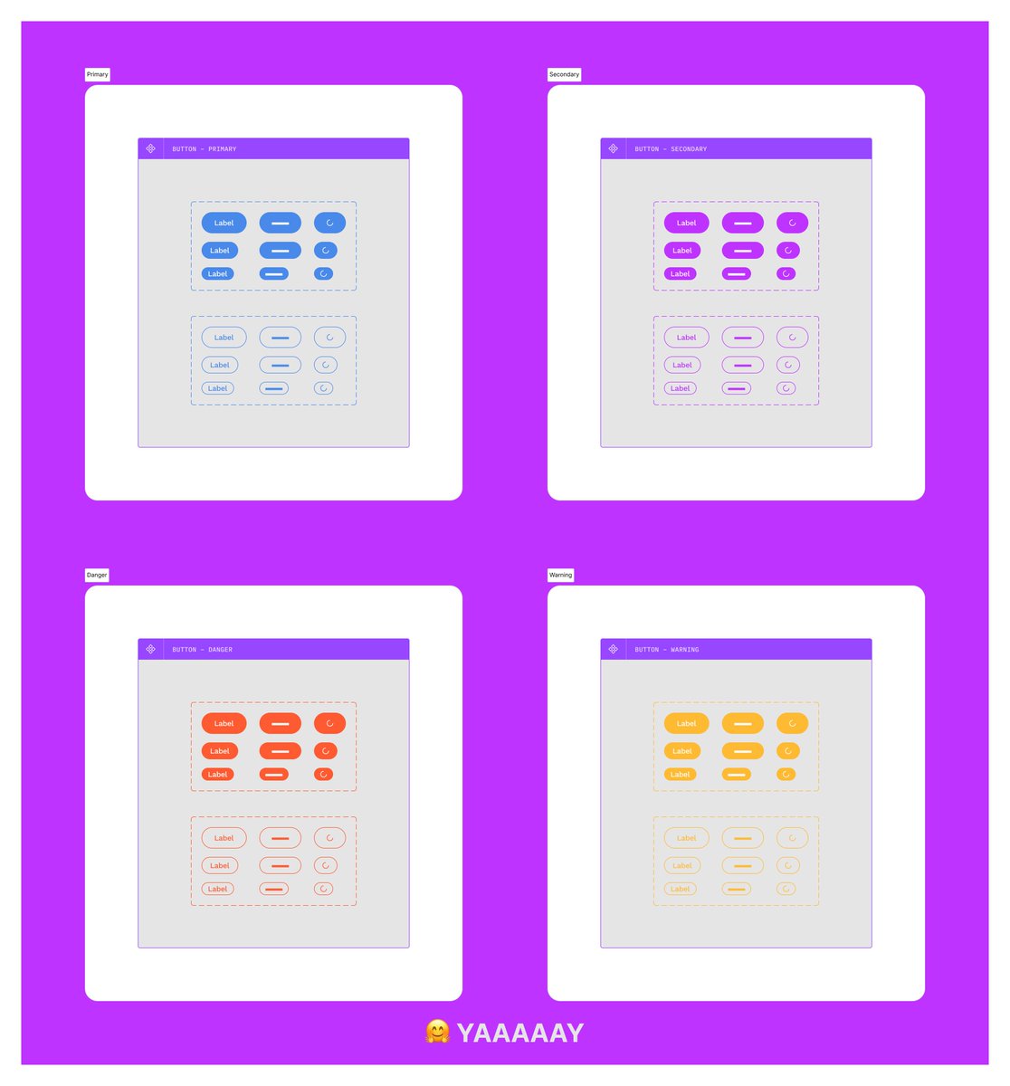
The key thing here is using this structure:
Page  Section
Variant
I personally think variants are best for combining types & states, with functional or visual differences being split
Primary & Secondary separate components, but Primary/Filled Primary/Outline combined
Section
Variant
I personally think variants are best for combining types & states, with functional or visual differences being split
Primary & Secondary separate components, but Primary/Filled Primary/Outline combined
Section
Variant
I personally think variants are best for combining types & states, with functional or visual differences being split
Primary & Secondary separate components, but Primary/Filled Primary/Outline combined 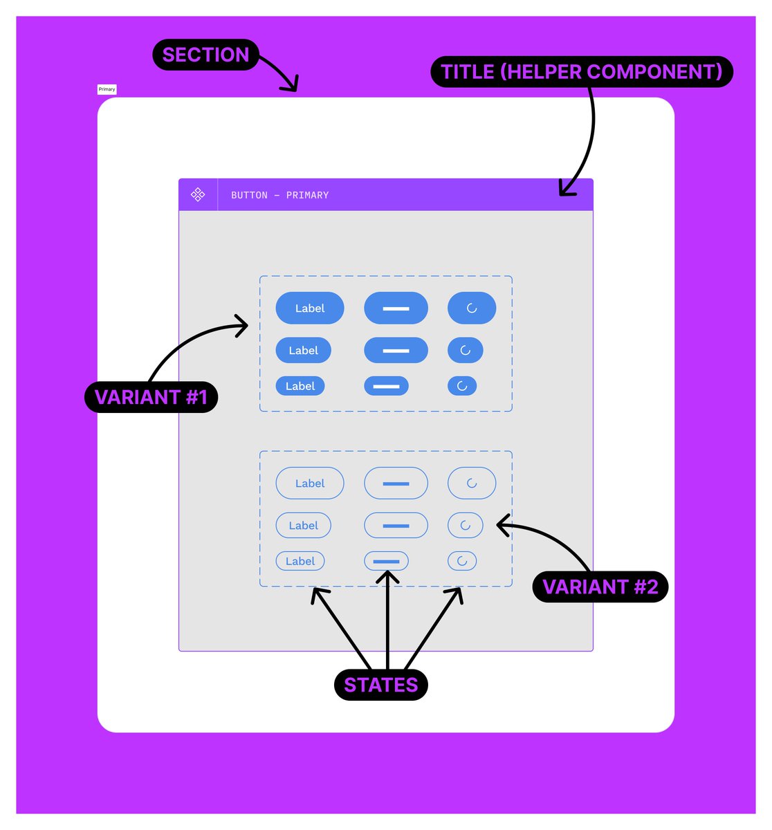
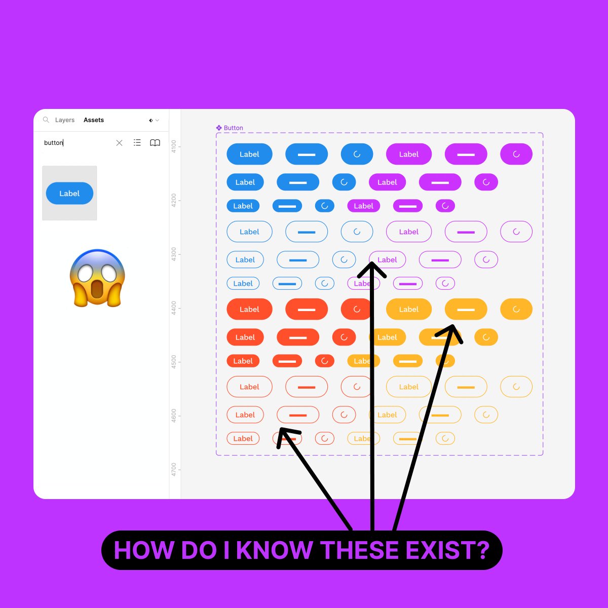
"That's a lot of components!" I can hear you shouting
Buuuut, remember when I said we should optimise for consumption and not creation?
The assets panel becomes visually way more easier to use, thanks to the categorisation we implemented

Back to the variant combos for a second...
If you *do* combine everything into one variant, you're putting a lot of pressure on your consuming designer to understand the possibilities of the component
How will they know what's possible if all they see is one component?

luis.
@disco_lu
Working @figma. I write a newsletter, host Design & Whine podcast, do things with @8pxmag. Twitter is where I share ideas about ❖. I eat 🌶️ with everything
Missing some tweets in this thread? Or failed to load images or videos? You can try to .