


 Dave Burton@ncdave4life
Dave BurtonSep 3, 2023
7 tweets
1/7. It tells a tall tale, Mark.
twitter.com/ncdave4life/st
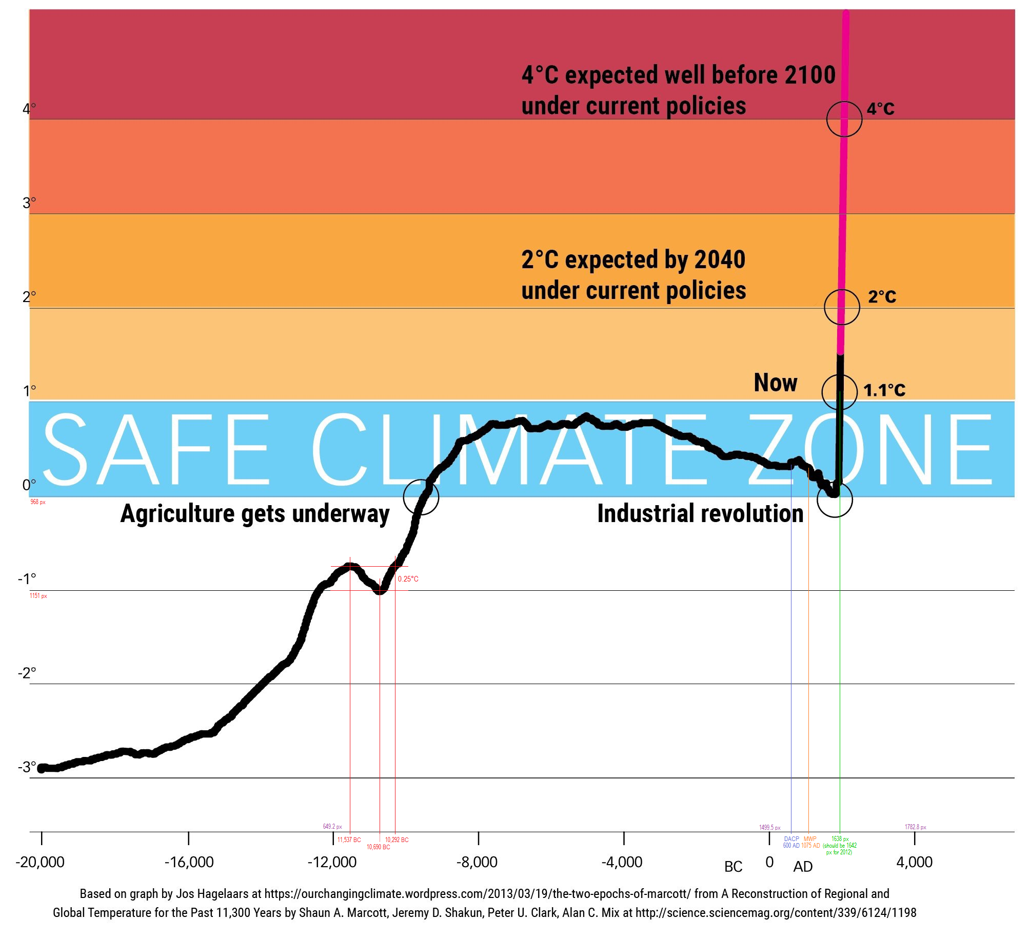
Here's a higher resolution version of that "tall tale," which I annotated (in very tiny print), to identify the DACP, MWP & Younger Dryas.
sealevel.info/safe_climate_z

Dave Burton@ncdave4life
Dave BurtonApr 17 23
View on Twitter
Come on, Mark, don't you remember that that's discredited?
And do you REALLY believe that global average temperatures 3000 years ago are known with a 1σ uncertainty of just 0.2°C, and 2σ (95%) of just 0.4°C? Come on, you have GOT to know that's absurd.
twitter.com/ncdave4life/st
2/7. In that revisionist "wheelchair graph" the tiny hiccup in warming trend around 11K years ago is the Younger Dryas (YD). They show cooling of only 0.25°C, spread over 850 years, and undone by 0.25°C of warming over the next 400 years. That's absurd.
twitter.com/ncdave4life/st
Dave Burton@ncdave4life
Dave BurtonSep 02 22
View on Twitter
The problem with that infamous Shakun / Marcott "wheelchair" graph is that it is wrong.
twitter.com/ncdave4life/st
3/7. Greenland typically sees temperature changes 3-4× greater than the global average, but even if it were 10× greater, that wheelchair graph would still show only 2.5°C Greenland cooling over 850 years, and then 2.5°C warming over 400 years.
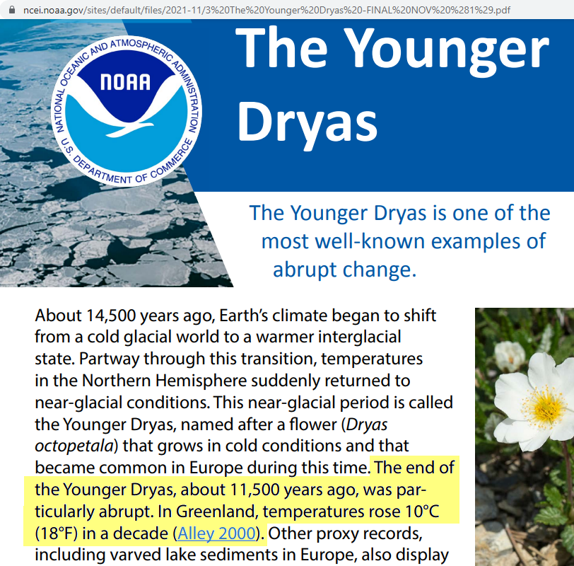
4/7. But here's what NOAA says about the Younger Dryas. It's obviously impossible to reconcile with that revisionist Shakun / Marcott "wheelchair graph."
twitter.com/ncdave4life/st
Excerpt: "In Greenland, temperatures rose 10°C (18°F) in a decade."
sealevel.info/Younger_Dryas_


Dave Burton@ncdave4life
Dave BurtonJun 06 23
View on Twitter
1/4 That's wrong, Jim. Ice cores show Younger Dryas & earlier D-O event warming rates an order of magnitude faster:
archive.is/aUi9R#selectio
science.org/doi/10.1126/sc
ncei.noaa.gov/sites/default/
The Younger Dryas termination is thought to have warmed Greenland 10 °C in just ONE decade!

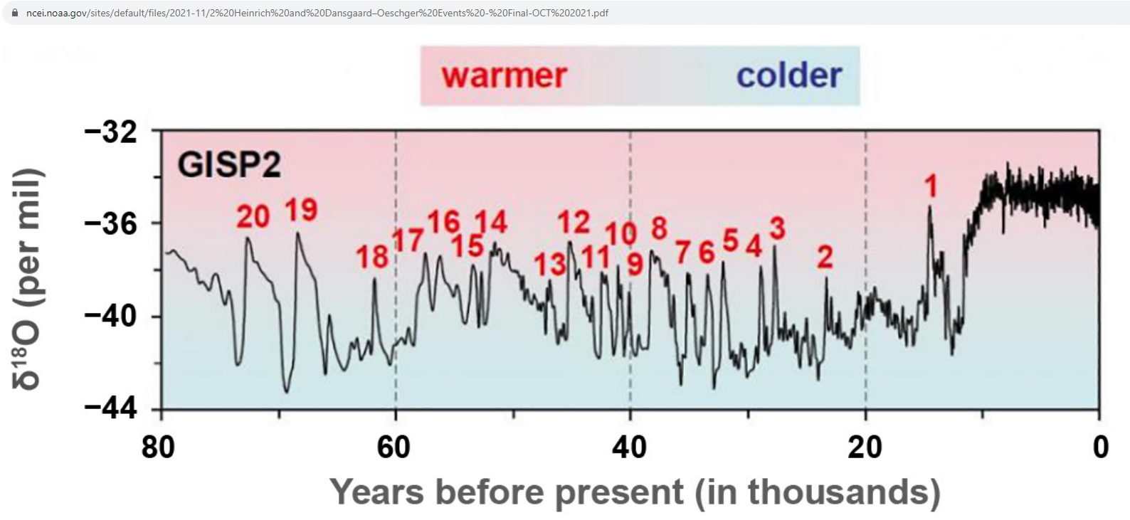
5/7. They also completely erased Dansgaard-Oeschger event #1, which was the HUGE warming event, recorded in ice cores, that you can see in this NOAA plot:
sealevel.info/Dansgaard-Oesc

6/7. That preposterous "wheelchair" graph also shows the middle of the Dark Ages Cold Period as slightly WARMER than the middle of the Medieval Warm Period. Surely you can recognize how ridiculous that is!


7/7. But you needn't examine such details to see that the graph is propaganda, rather than science. That "safe climate zone" label gives it away. That's obviously 100% pure BS.
During the Eemian Optimum Antarctica was an estimated 3°C WARMER than the top of their "safe zone!"


Dave Burton
Dave Burton@ncdave4life
My preferred pronoun is "harmless data drudge." https://t.co/YTkK6vaHGs Tel: +1 919-481-0098.
Missing some tweets in this thread? Or failed to load images or videos? You can try to .